Author: Jo

Sunny Square in Venice

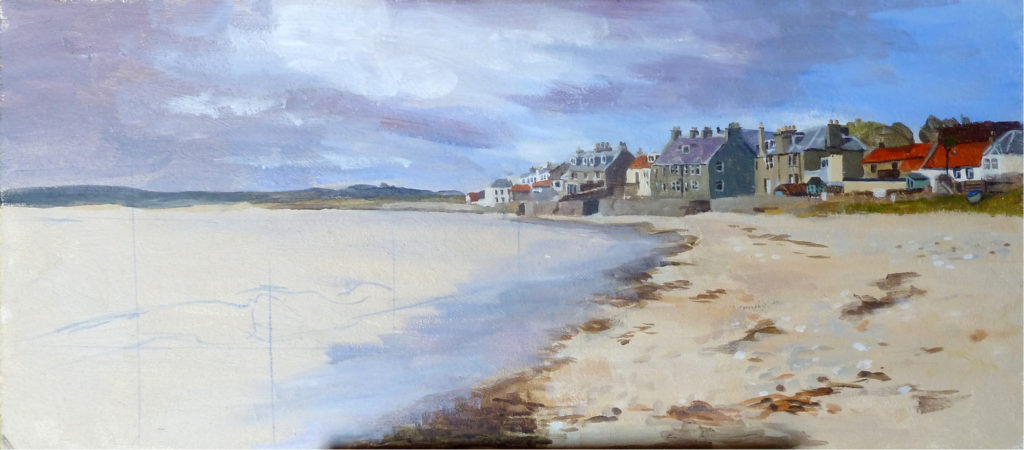
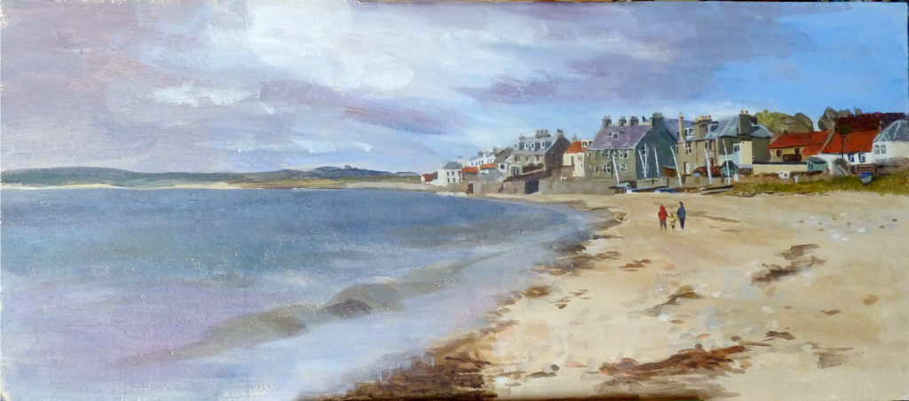
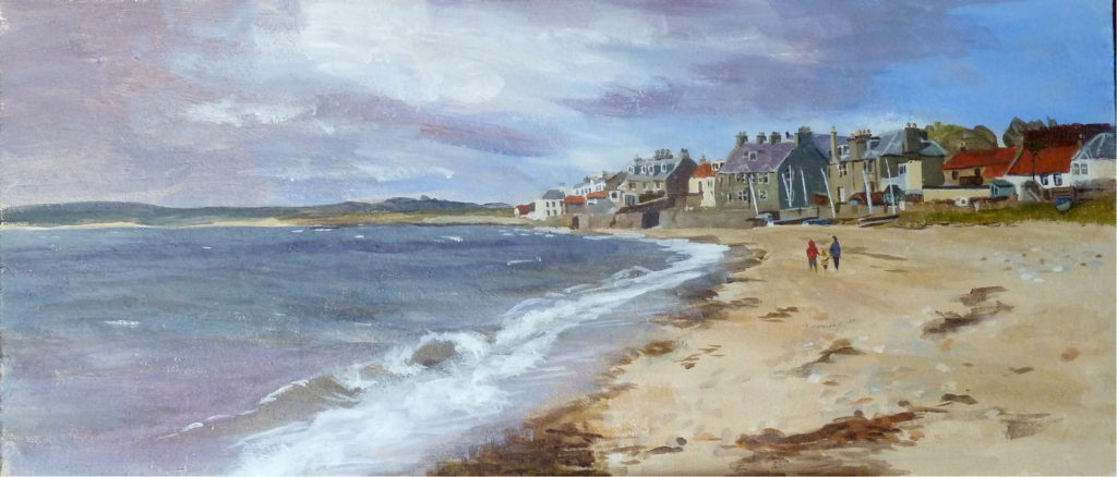
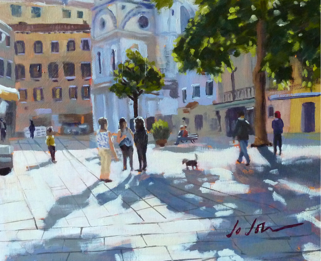
Oil on Gesso primed plywood panel. (8″ x 10″ approx.)

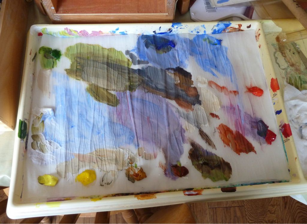
I enjoyed painting this light filled scene from a photo I took in Venice two years ago. I’ve been diligently trying to achieve a looser, more painterly approach and also, to concentrate on establishing the correct balance of tonal values from the very first “roughing in” stage of the painting. I feel I’m getting somewhere – slowly, though. Making it look easy is not easy! Counterintuitively, I’m discovering that to create a spontaneous look actually requires a methodical, analytical, considered brush-stroke by considered brush-stroke approach. But it’s a wonderful discovery and one that makes me want to get to my easel at every opportunity!

Old Cars!

1930’s American Bantam Model 60, Conte chalk on Ingres Paper

Pardon the pun but I’ve always been “drawn” to old cars as a subject, especially old cars that have been abandoned and are beginning to decay and fall apart. There’s something sad about an old rust-heap and yet the beauty of the original design and the engineering skill that went into these magnificent creatures somehow shines through all the more.

I say “creatures” because old cars like these seem to take on a personality of their own – they speak to me; they say: “I used to be something special; people valued me and cared about me – even loved me – until a newer, better model came along and then they retired me – relegated me to the second-hand market and eventually I ended up here, a discarded, useless, decrepit piece of junk! But in my heyday….you want to have seen me!”

Maybe these beautiful old beasts are a kind of metaphor for the arc of life we all go through as we age – eventually we all have to face up to the bitter truth that we’re not as fit or as sharp as we used to be – sooner or later we get replaced by younger models with more energy, youth and drive.  Ah, but you should have seen me in my heyday!

Mercedes Benz 170V, Pencil on Ingres Paper


Conte chalk drawing Ford Prefect, Conte Chalk on Ingres Paper, 25" X 25"

Vintage Ford Prefect Drawing

I made this drawing of what was left an old Ford Prefect, which had been abandoned on a disused railway line outside the village where I used to live many moons ago! I was a “wet behind the ears” first year student at Glasgow School of Art at the time and I made the drawing in response to the annual First Year Drawing competition which was run over the Christmas and new Year holiday period that year. The title that we were asked to illustrate was “Inside/Outside” – an intriguingly open ended subject title which gave lots of scope for choice. I went out for a walk one day, came upon this old hulk rotting away quietly and thought, “Wow! that would make a great drawing!” I remember it well because it was the middle of winter and it took me three very cold mornings to finish the drawing! I pulled the battered bonnet of the car and the seat springs out and re-arranged them to make it more obvious that the inside was actually outside!

It turned out to be worth turning my fingers to ice each day, because along with several other first year students, my drawing was nominated as a winner – the prize was a three-day trip to go round the London Galleries with one of the 1st year tutors! And a memorable experience it was too because we visited the Constable exhibition which was held at the Tate Gallery in early 1976. I was bowled over by the sheer scale and number of Constable’s work and longed to be able to paint with the same skill and panache. (If only it had worked out like that!)

Prints of this work are available via

 Redbubble or FineArtAmerica

The Development of a Painting

I thought I’d show the stages I went through in the development of this little painting of Lower Largo in the bonny county of Fife, which I painted for my nephew and his wife. It was very refreshing to take a break from creating black & white designs for my adult colouring book (which I hope to publish in the autumn) and re-acquaint myself with brushes and paint. It reminded me of how much I enjoy the physicality of mixing and putting paint on canvas just as much as analysing the tones and colours required. And that elusive quality of painterly-ness that I strive to achieve, still dances frustratingly – just out of reach!

The photos speak for themselves, so I’ll ditch the descriptions and let your eyes teach you all you need to know.

LowerLargoStage01

LowerLargoStage02

LowerLargoStage03

LowerLargoStage05

LowerLargoStage06

LowerLargoStage07

LowerLargoStage08

Lower Largo, Acrylic on Board, 9" x 18" (approx)
Lower Largo, Acrylic on Board, 9″ x 18″ (approx)

pallette

My Daler-Rowney “Stay-Wet” Palette. A great invention!

waterlily painting "Waterlily" Watercolour on Arches paper, (9" X 6" (approx)

Waterlily

I’ve spent a very enjoyable couple of days on & off, painting this beautiful lily that is gracing our garden pond at the moment. This is a mixed media painting – watercolour, white chalk and white gouache paint. I’m afraid the delicate, lucid tones of the stamens eluded me! Which points up the fact that Art only imitates nature, it can never portray accurately the amazing delicacy and subtle nuances of light that we see with our eyes. As Picasso famously said: “Art is a lie which makes us understand the truth.” in other words my painting, or anyone else’s for that matter, can only be an approximation; we have to find an equivalent in paint or whatever medium we work in, that will at best enable us to mimic on paper or canvas the effect of light .

waterlily painting
“Waterlily” Watercolur on Arches paper, (9″ X 6″ (approx)

“Consider the lilies of the field, how they grow; they toil not, neither do they spin: And yet I say unto you, That even Solomon in all his glory was not arrayed like one of these…” (Matthew 6:28,29)

Prints of this work are available via

 “Redbubble” or “FineArtAmerica”